
Instagram is an excellent social media platform for showcasing visual content, but when you scroll through an individual’s profile, you find something more — you find that the people and businesses are telling a visual story. Here’s how you can, too.
When scrolling through Instagram, one thing you might notice is that celebrities and Instagram-famous stars cultivate their Instagram feed with beautiful colors and photographs that bring cohesion to their profile. You might ask yourself, “How do they do that?” and “How can I do it, too?” To answer those questions, we are going to talk about a few details surrounding Instagram color schemes, all of which can bring cohesion and uniqueness to your profile.
Color schemes are important. They not only draw attention to your profile, but they set a cohesive tone for your business or personal brand. The colors you choose can also help bring personality to your Instagram feed. Here are some steps to take when considering your Instagram color scheme:
1. What kind of content are you wanting to show?
Whether you are a fashion guru or an adventurer, finding a theme for your photos will help bring a cohesive look to your Instagram feed. If you gravitate towards a nautical theme, continue posting pics of the beach, your sun-dress, or the fruity cocktail that gives the essence of the beach. However, don’t forget to change up the subject. Don’t let your Instagram feed simply be of you, in front of the beach…in every picture. Find and showcase other relevant things that surround you or showcase your business. Do that, and you can really spice up your feed and tie your pictures together.
When trying to pick out a color scheme for your Instagram feed, think about what kind of content you want to show or plan to show. With this content, are there certain colors that you frequently gravitate to? If so, think about how these colors tell the story that you want to share. Once you find this color palette, try to stick with it for future posts. Furthermore, if you’re creating an Instagram feed for a business, you’ll want to stick with colors that match or work with your branding.
2. What feeling are you wanting to portray to people?
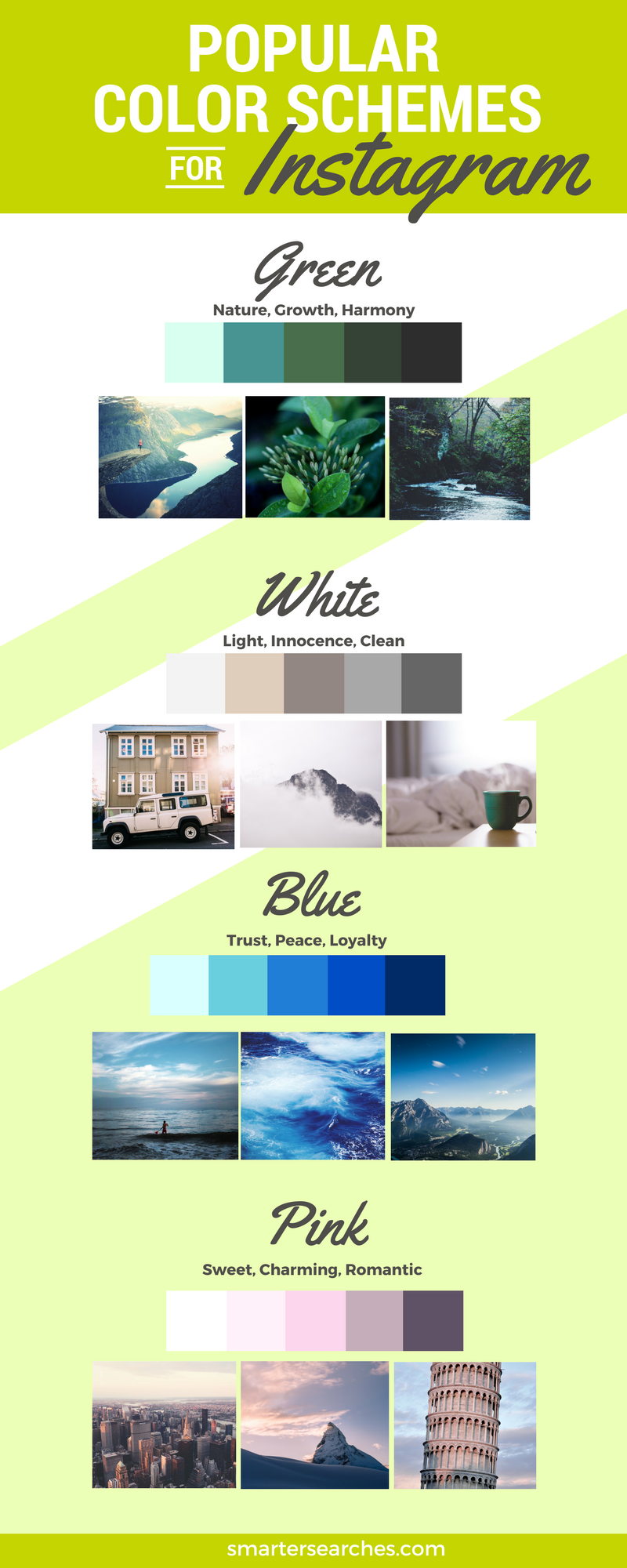
The Meaning of Colors
Your Instagram profile is an extension of your personality or brand, so show it! Do you want to show energy, passion, solitude, or something edgier? No matter what feeling you want to emit, colors can help you express it. For example, are you passionate and want to attract attention? If so, you might consider a red or an orange-based color scheme. Or, let’s say you love nature and freshness – green or blue is a good color for you. Consider the meanings of colors when you are revamping your Instagram feed — they can help you figure out the basis of your color scheme. To help you get started, check out these helpful tips on the psychology of colors in marketing.
Tone
When you look at a well-put-together Instagram profile, you will see a specific tone — whether warm or cool — amongst the pictures. If it’s a warm tone, you might see more browns, tans, and oranges. Likewise, if it’s a cool tone, the profile might feature blues, purples, greens, and grays. These relative warmth and coolness ratings can further create a desired, cohesive feeling on your Instagram feed.
Keep in mind, however, that many colors have the ability to be both warm or cool — it simply depends on how they were mixed with other colors. So, while green is definitely cooler than red when compared side by side, there are varying degrees of warmth and coolness to each of those colors. Want a warmer green or cooler red? If you’re trying to select a color hex code from your computer, simply select a less saturated version of your color that veers towards its complementary color (colors opposite each other on the color wheel).
3. Color Scheme
Do you have your primary (and we don’t necessarily mean red, yellow, or blue) color selected? Good, but you aren’t finished. You now need to bring the profile together with a color scheme — or the combination of colors that will best represent you, your business, and your profile. While you can get away with using one color as your feature color, it’s important to understand that colors work best when used with other colors. Not only are they more dynamic, but they have more depth and visual interest, all of which will translate to better Instagram photos. So, for this section, we want you to keep it simple and locate the colors that supplement your desired look. Think of it this way: try to find the supplementary colors that aren’t the focal point, but help tell your story or sell the desired feeling.
To get started, first refer back to step #1. What colors are part of your branding package? Or, are there certain colors you gravitate to? Next, if you have multiple colors in mind, do they complement each other? Do they make your Instagram feed look better when used together…or do they clash in the most horrible of ways? Are your colors aligned with your desired feeling, or do they say or refer to something unintentional? Only work with a color scheme that creates and strengthens the feeling you want to portray.
Researching Color Ideas
Once you’ve gone through these steps, you should have a good idea of the pictures, colors, and tones that represent you. Review some color schemes from Design Seeds, or take a look at our infographic on popular color schemes for Instagram attached below. Let us know what you go with in the comments!


